New · Live demo
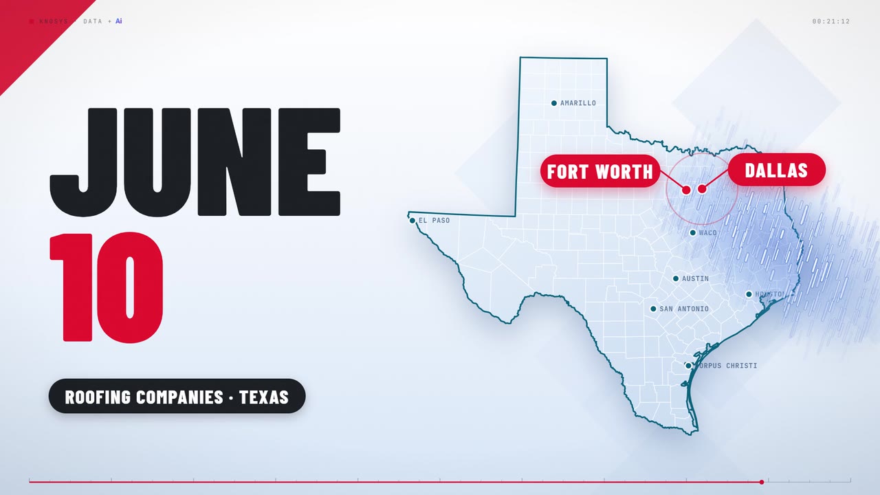
Ten roofing branches.
One hail storm.
The whole story.
A CFO, a VP of Operations and a branch manager ask Knosys their own questions.
Next-generation business intelligence
Ask in plain English. Get the graph, the formula, the alert and the story — in seconds, not sprints.
 New Chapter › Dashboard
DATA MART · Enterprise Performance ▾
Hello, Alex ▾
New Chapter › Dashboard
DATA MART · Enterprise Performance ▾
Hello, Alex ▾
Join any data source
Point Knosys at your databases, APIs and files. Ai works out how they relate and builds the data mart.
See the story
Ask for what you want to see. Change it, cut it a different way, follow the trend to its cause.
Put eyes on the data
Publish a story, set the alerts, and let the numbers reach people without another meeting.
Every source is compatible with every other one. Join a Snowflake table to a Salesforce object to last quarter’s spreadsheet, without a line of SQL. Automated scheduling and refresh queues keep it current.
Compatibility shown. No affiliation or endorsement implied.
Ai suggests the joins and flags the mistakes before they cost you a quarter. You confirm; it builds.
Import, shape and build data marts without a second tool, with wizards for the common tasks.
Google Blockly blocks plus Ai, for new dimensions, measures and calculated fields.
Date shifting, so a work shift crossing midnight counts as one day. Scheduling and refresh queues, so the mart stays live.
Compatibility shown. No affiliation or endorsement implied.
Pie, donut, bar, line, area, bubble, curve, scatter, summed, stacked, floating, rotated and OHLC — many with 3D variants. Tooltips and drill-downs let you follow a trend to its cause. Maps add geographic and statistical context. A dashboard editor throws a presentation together, and reports sit alongside the graphs.
It is a data analyst who never has a backlog.
The same question, asked two ways.
A request email, a spreadsheet called report_FINAL_v7_REAL.xlsx, two revision rounds, and a meeting to explain it.
Show revenue by region
One line typed in plain English. The graph is on screen before you finish reading this.
Savings and speeds may differ for some customers.
New · Live demo
A CFO, a VP of Operations and a branch manager ask Knosys their own questions.
You will not need training. Ask it a question the way you would ask a person, and read the answer.
Connect the same sources, keep the same data, lose the ticket queue. Your model comes across; the wait does not.
Give them back the hours they spend answering requests, and let them build the things only they can.